Our final brief has recently been set with the input of Kate Usher a wallpaper and surface designer based in the North East. She describes her designs as ageless, timeless and elegant with a playfully cool and quirky edge.
The basic brief is to design wall coverings for either boutique hotel or children. To the surprise of many I've chosen to design for children. As a challenge to myself I'm determined to branch out from my usual neutral and monochrome colour palettes and use colour!!!!
With previous briefs I've usually had a fairly good idea where my designs would go from the outset however this one has proved more challenging , being so open the possibilities are endless so where to start....
When I'm not sure what to do I find returning to mark making very grounding and gives me time to think about how I could apply the marks. I think the actual marks I make are just as important as the final image so I want to explore ways of combining the two, particularly if I am to use colour on a large scale.
Along side this I researched into trends for 2013 -14, these were more difficult to find as not many trend predictors are willing to give much away too for future seasons. However I did find some information on colour trends and created several inspiration boards as possible colour palettes.
Love the fresh zing of this colour combination, perhaps not immediately identified as a traditional choice of colour for children but I think would give a room a playful contemporary feel
This colour palette feels calm and light. These colours remind me of time spent in scandinavia where water plays an important feature in the landscape complimented by houses painted in dark pinky red tones
I like the depth of this colour palette colours together the colours create a sense of security and cosiness
The images used to create the mood boards are not directly related to my theme of rock pools, instead I decided to look at a wider range of images and object to expand my thinking.
After looking at some of the work of children's book illustrators (see earlier post) I was inspired by the hand drawn qualities of many of their work and thought that this was something I wanted to retain in my work. I decided to begin teaching myself Illustrator in order to scan my drawn images in and convert them to vector images which would make them easier to manipulate at a large scale if I chose a digital route. Something I have become interested in is using my marks to create a range of papers for collage. It took a long time to get to begin to get to grips with Illustrator and many stopping and starting YouTube videos before I had much success. Here are the first results not perfect or the right colours yet but they will be useful for preliminary work.
Looking back over this post, particularly the mark making, reminded me of a little video I captured a few weeks ago of sunlight shining through my rainy window so I thought I'd share it with you! The patterns really intrigued me.
Drawing
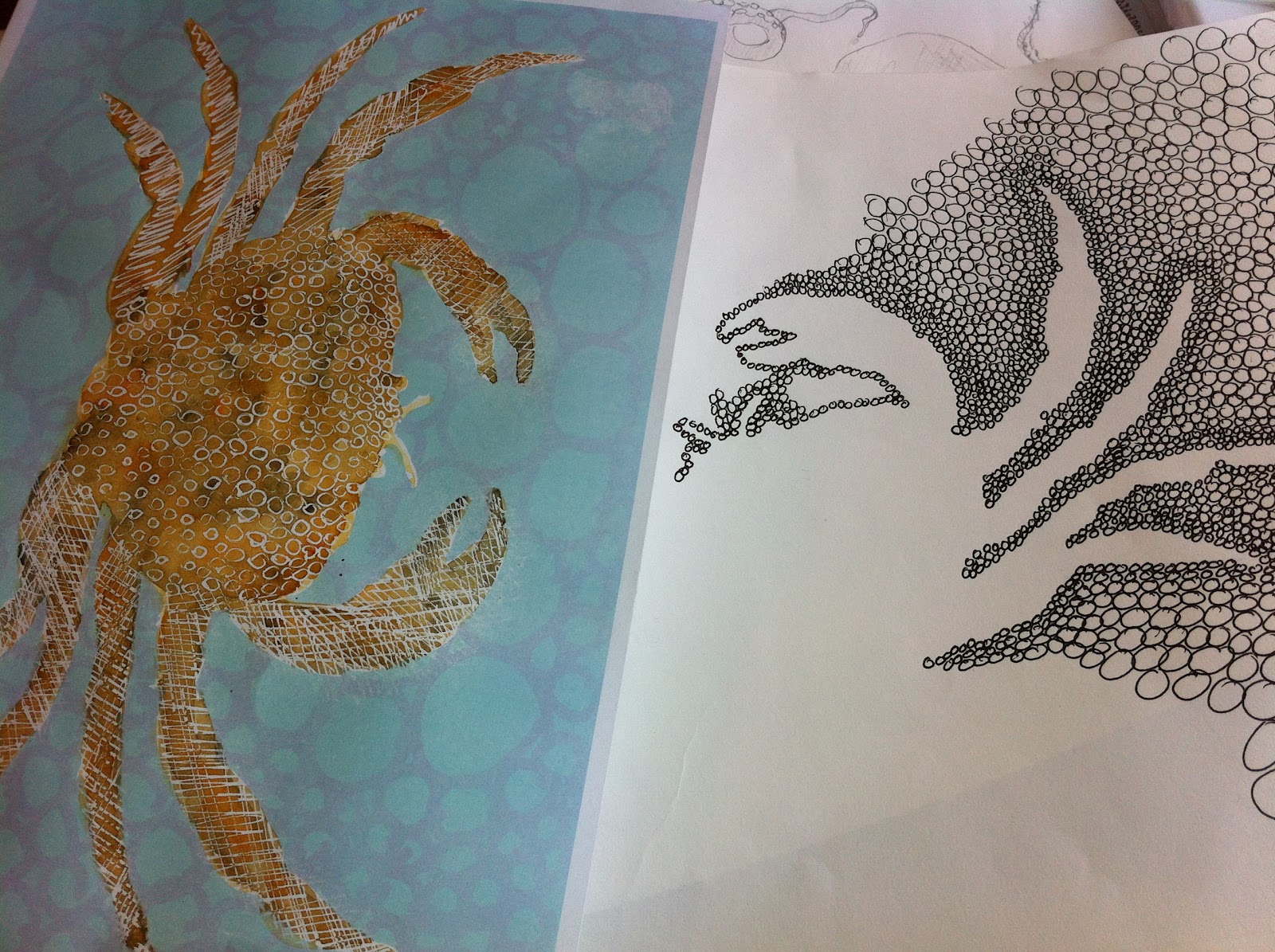
Having worked on my mark making images and beginning to make decisions about which ones I will use to create my collage papers I have begun to tackle the central theme of my design through the idea of childhood memories. Part of my research suggested that in times of economic restraint societies tend to look back to the past for reassurance and comfort. One of the trends coming through a variety of media, including film, was the notion of childhood and simpler times. I decided to use this as a starting point reflecting back on things I enjoyed myself and with my children when they were small and I settled on the idea of rock pools. Having made this decision i began drawing a variety of sea creatures and artefacts from primary and secondary sources. here are a few examples.

Pencil drawings using fine hard pencils and graphite sticks
Colour work using negative space created in photoshop image, coloured using watercolours with lines drawn in masking fluid. Pattern work developing from close detail found in crustacean shells
sea urchin sketches using pen and pencil in a variety of techniques.


